
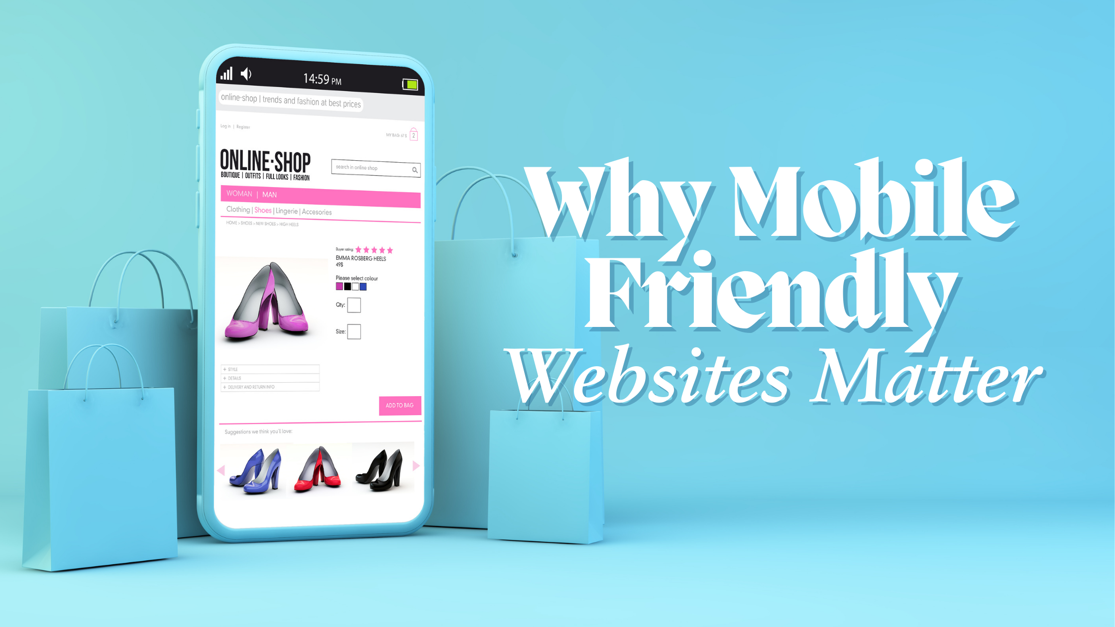
Why Mobile-Friendly Websites Matter
More people than ever use their phones to browse the internet. A mobile-friendly website isn’t just a nice-to-have anymore; it's a necessity. If your website doesn’t work well on mobile devices, you risk losing a lot of visitors and potential customers. A website that is hard to navigate on a phone or takes forever to load can frustrate users, causing them to leave and never come back.
Having a website that performs well on mobile devices is crucial for keeping up with competitors and meeting the expectations of today’s users. Mobile usage will continue to grow, and businesses need to adapt to stay relevant. Ensure your website is mobile-friendly, and you will likely see benefits across several areas of your business.
Enhanced User Experience
A mobile-friendly website makes a huge difference in user experience. Navigating on mobile devices can be tricky if the website is not designed for smaller screens. Menus, buttons, and links should be easy to see and tap on. Users shouldn’t have to zoom in and out to read text or view images. A clean, simple layout helps ensure visitors can find what they’re looking for with ease.
Touch-friendly design is essential for mobile websites. Unlike a mouse, fingers are less precise, so buttons and links should be larger and spaced apart. This prevents accidental taps and improves the overall usability of your site. Additionally, think about implementing gestures like swiping to make navigation smoother and more intuitive.
Load times and responsiveness are crucial for keeping visitors on your site. Mobile users often don’t have the patience to wait for slow pages to load. If a page takes too long, they might leave and never come back. By optimizing images and using efficient coding practices, you can make your site load faster. Responsive design, which automatically adjusts the layout based on the device’s screen size, ensures a consistent experience across all platforms.
Higher Search Engine Rankings
Having a mobile-friendly website can significantly boost your search engine rankings. Google uses mobile-first indexing, meaning it primarily looks at the mobile version of your site for ranking and indexing. If your site isn’t optimized for mobile, it could hurt your search rankings. This makes it harder for potential customers to find you when they search for your services or products.
The impact on search results is noticeable when your site is mobile-friendly. Sites that are easy to navigate and load quickly on mobile devices tend to rank higher in search results. Higher rankings lead to more visibility, which can drive more traffic to your site. This is especially important for small businesses that rely on local searches to attract customers.
The benefits of SEO for mobile-friendly sites extend beyond just higher rankings. Good mobile design improves user engagement, which can lower bounce rates and increase the time visitors spend on your site. Search engines notice these positive user signals and may rank your site higher as a result. By focusing on mobile optimization, you can enhance your SEO efforts and attract more visitors to your site.
Increased Conversion Rates
A mobile-friendly website can significantly boost your conversion rates. Simplified checkout processes are essential for users browsing on phones. Complicated steps can make users abandon their carts. By streamlining the process and reducing the number of steps needed to complete a purchase, you make it easier for users to buy from you.
Mobile-friendly forms and calls-to-action (CTAs) also play a vital role in conversions. Forms should be easy to fill out using a touchscreen, with larger fields and buttons. Place clear and concise CTAs where users can easily find and click on them. This encourages users to take action, whether it’s signing up for a newsletter or making a purchase.
User trust and security are critical for mobile users. Many people browse and shop on their phones, so they need assurance their data is safe. Displaying trust badges, using secure payment methods, and having a clear privacy policy reassures users. When they feel secure, they are more likely to complete transactions, boosting your conversion rates.
Staying Competitive
A mobile-friendly website helps you stay competitive. Meeting customer expectations is crucial since most users expect websites to work well on their phones. If your site isn’t mobile-friendly, users might leave and turn to competitors who offer a better mobile experience.
Keeping up with competitors means you need to offer at least the same level of mobile usability. Many businesses have already optimized their websites for mobile devices. Falling behind in this area could mean losing customers to competitors with more user-friendly sites. Regularly updating your website to ensure it stays mobile-friendly can keep you in the race.
Future trends in mobile usage indicate an ongoing increase in mobile internet traffic. More people are using their phones to browse, shop, and interact with businesses online. Adapting to these trends ensures your business stays relevant and capable of meeting the growing demands of mobile users.
Conclusion
Having a mobile-friendly website is critical for providing a good user experience, improving search engine rankings, increasing conversion rates, and staying competitive. As more people use their phones to browse the web, businesses must adapt to meet these needs. Poor mobile experiences can drive users away, while a streamlined, responsive site can attract and retain visitors.
Mobile optimization is not just a technical upgrade; it’s an investment in your business’s future. Ensuring your website loads quickly, navigates easily, and looks good on all screen sizes can lead to more satisfied customers and better business outcomes. Faster load times, higher search rankings, and increased user trust all contribute to a successful mobile strategy.
Ready to make your website mobile-friendly and seize the potential benefits? Contact New Level Digital today to learn how our custom web design services can help you optimize your site for mobile devices and stay ahead in the competitive market!