
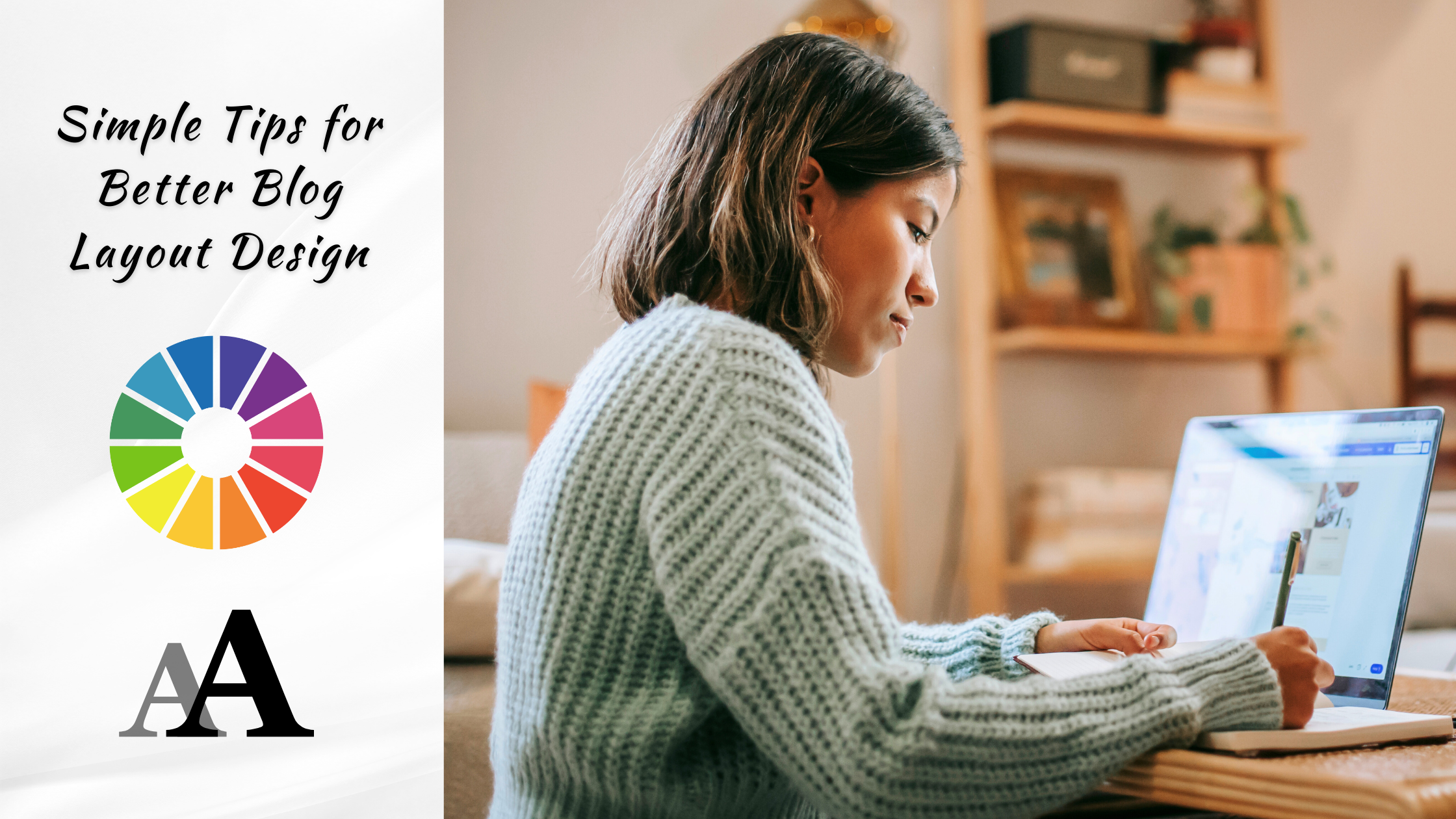
Simple Tips for Better Blog Layout Design
A well-designed blog layout plays a big role in grabbing and keeping a reader's attention. If your blog looks clean and easy to read, people will want to stay longer and explore more of your content. A good layout can guide visitors smoothly from one section to the next, making the experience enjoyable and informative.
Choosing the right design elements can make a huge difference. Things like white space, typography, and image placement all add to the overall look and feel of your blog. By carefully considering these factors, you can create a layout that is both eye-catching and practical.
In this article, we'll explore some simple yet effective tips for improving your blog's layout. By focusing on key design principles, you can enhance your blog's readability and appeal, ensuring a positive experience for your readers.
Understanding the Importance of Blog Layout
How Layout Affects Readability
The layout of a blog can greatly influence how readers perceive and engage with your content. When a blog is easy to read, visitors are more likely to stick around and absorb the information. A well-organized layout helps guide the reader’s eye, making it easier for them to follow the text from start to finish. A clear and structured layout can also highlight the main points and make important details stand out, ensuring that nothing gets lost in the shuffle.
An effective blog layout uses elements like headings, subheadings, and bullet points to break down large chunks of text. This organization aids comprehension and keeps readers engaged. When content is easily digestible, users can scan and understand it quickly, which is especially important in today’s fast-paced world. The design should facilitate a smooth reading experience, encouraging users to explore further or visit other parts of your site.
Impact on User Engagement
The design of your blog doesn’t just affect readability; it also plays a major role in user engagement. An attractive and user-friendly layout can entice readers to spend more time on your site, boosting engagement metrics like time on page and scroll depth. When readers find an accessible layout that meets their needs, they’re more likely to interact with the content, leaving comments, sharing posts, or exploring additional articles.
A strong layout can help establish a connection with your readers by ensuring that your content is approachable and easy to navigate. By creating a positive first impression with a clean design, you encourage users to become regular visitors. Building such familiarity and trust with your audience can lead to increased loyalty and a stronger online presence.
Key Elements of a Strong Blog Layout
Effective Use of White Space
White space, or the space around text and images, is a crucial element of a strong blog layout. It provides breathing room for your content, making it easier for readers to focus on what's important. White space doesn't have to be white; it simply refers to the empty areas that help separate different elements on the page. By giving your text and images room to breathe, you enhance readability and improve the overall aesthetic appeal of your blog.
Using white space effectively means balancing the amount of content and background to avoid overwhelming the reader. When used correctly, white space can guide the reader’s attention to the key parts of your blog, allowing them to process the information more efficiently. It's a simple design principle, but one that can significantly improve the user experience by making your blog look neat and organized.
Choosing the Right Typography
Selecting typography that complements your blog is another essential aspect of creating a strong layout. The fonts you choose should be easy to read across different devices and screen sizes. Consider using a simple, clean font for body text and a more decorative style for headings to create visual contrast. This makes it easier for readers to distinguish between different text elements while maintaining a cohesive look.
Varying text sizes and styles can help emphasize important sections and guide the reader’s eye through the content. Ensure that your chosen typography aligns with your brand's voice and tone, which helps create a consistent identity throughout your blog. Good typography enhances readability and keeps your readers interested by making the content more accessible and visually appealing.
Common Blog Layout Mistakes to Avoid
Overcrowded Pages
One of the biggest mistakes in blog layout is overcrowding the page with too much content. Cramming too many elements into one section can overwhelm visitors and make it hard for them to focus on what matters. This includes excessive text, numerous banners, and unnecessary sidebars. To avoid this, prioritize your content and remove anything that doesn't add value. Organize information in a clean and structured way so that readers can easily find what they're looking for. Keeping a balance between text, images, and white space ensures a more visually pleasing experience.
Poor Image Placement
Images are a crucial part of engaging your audience but placing them poorly can disrupt the flow of your page. Mistakes like aligning images awkwardly with text or using low-quality images can negatively impact the user's experience. To avoid these mishaps, place images strategically where they complement the text and enhance understanding. Use high-quality images that relate to your content for a professional look. Moreover, always include descriptive alt text for images, which helps with accessibility and SEO.
Simple Design Tips for Enhancing Your Blog
Consistent Color Schemes
Using a consistent color scheme throughout your blog helps set a cohesive tone and reinforces your brand identity. Choose colors that align with your brand and stick to a palette of two or three main colors for simplicity. Consistency in color helps in building recognition and trust with your audience. Avoid using too many different colors, which can make the blog appear chaotic and unprofessional.
Utilizing Headers and Subheaders
Headers and subheaders play a vital role in organizing your content and making it more readable. They break up long sections of text, giving readers visual breaks and guiding them through the content. Use clear and relevant headers for each section to indicate what each part is about. Subheaders work well to detail different points within a section, helping keep the information digestible. This structure not only improves readability but also helps SEO, as search engines scan headers to understand the content better.
Conclusion
Creating an effective blog layout involves understanding key design elements and avoiding common pitfalls. Making thoughtful choices such as leaving sufficient white space, using appropriate typography, and placing images strategically contributes to a more engaging and user-friendly blog. A well-structured site not only improves the reader's experience but also supports your business goals by keeping visitors on your page longer and encouraging them to explore more.
If you're ready to improve your blog layout or build a new site that truly reflects your business values, reach out to New Level Digital. Our expertise in digital marketing and web design in Deltona can help you craft a site that aligns with your brand and captures your audience's attention. Let's create something amazing together!