
Why Website Navigation Is Crucial for Small Businesses
Website navigation plays a key role in how visitors interact with your site. For small businesses, having clear and easy-to-use navigation is vital. It helps visitors find the information they want quickly and keeps them on your site longer. When people can easily navigate your website, they are more likely to explore your services and become customers.
Understanding the Role of Navigation in User Experience
Importance of Easy Navigation
Good navigation is like a road map for your website. It helps visitors find their way around with ease. When your navigation is clear and simple, users can locate what they’re looking for without getting lost. This ease of use is particularly important for small businesses that rely on turning visitors into customers. If people can find your products or services easily, they are more likely to engage and make a purchase. Easy navigation means less frustration and a more positive experience, which can lead to increased satisfaction and loyalty.
Impact on User Retention
Keeping visitors on your website longer is crucial for business success. If your navigation helps users find interesting content quickly, they are more likely to stay around and explore other pages. A well-organized navigation system encourages visitors to move deeper into your site, discovering more about what you offer. This can lead to higher retention rates and a greater chance of converting visitors into long-term customers. In simple terms, when your navigation works well, people enjoy their time on your site and might even come back for more.
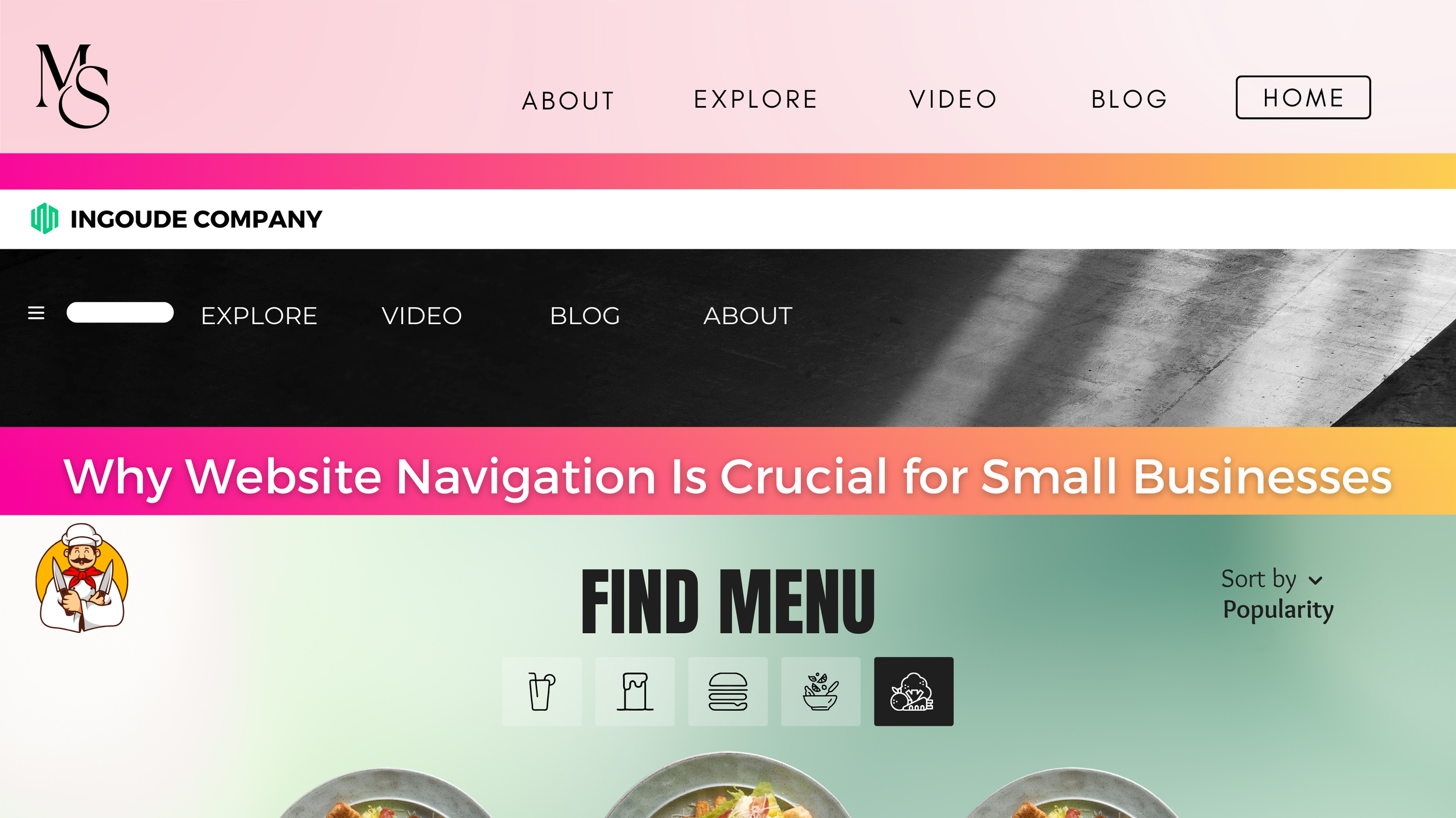
Key Elements of Effective Website Navigation
Clear and Concise Labels
Effective navigation starts with using clear and concise labels. Visitors don't want to guess what a menu item means. Use familiar words that people understand and label sections in a straightforward way. Avoid using jargon or creative names that might confuse someone. For instance, instead of labeling a product page as “Discover Magic,” simply call it “Shop” or “Products.” Clear labels help users know exactly what to expect when they click on a link.
Logical Structure
A well-structured website makes it easy for users to move from one section to another. Organize your navigation in a logical order, starting with the most important pages. Think about how users browse your site and arrange the menu items accordingly. Consider using categories and subcategories to group similar pages together. A logical and organized menu structure helps users find information faster and ensures a more pleasant browsing experience. With a clear path to follow, visitors can explore your site with confidence.
Common Navigation Mistakes to Avoid
Overloading Menus
One of the biggest mistakes in website navigation is overloading menus with too many options. When users see a crowded menu, they might feel overwhelmed and find it harder to locate what they need. Keep your main navigation menu simple by including only the most essential links. If you have a lot of content, consider using dropdown menus to organize related pages, but ensure that these dropdowns aren't too deep. The aim is to make choices clear and easy so that visitors can navigate smoothly without confusion.
Inconsistent Design
Another common mistake is having an inconsistent design across different pages. If your navigation style changes from one page to another, it can disorient users. They might wonder if they are still on the same website. Maintain a consistent design for all navigation elements, including menus, buttons, and links. This includes using the same fonts, colors, and placements throughout your site. Consistency helps users feel secure and understand how to interact with your website, making their journey more pleasant and predictable.
Enhancing Navigation for Better Business Results
Simplifying Mobile Navigation
With more people browsing on smartphones, it’s important to simplify navigation for mobile devices. Mobile screens are small, and cramped menus can be frustrating. Use responsive design to ensure your navigation adapts to different screen sizes. Hamburger menus, indicated by three horizontal lines, are a popular way to hide the menu options until needed. Simplifying mobile navigation helps users easily find what they want, even on a smaller screen, which can improve their experience and encourage them to stay longer.
Testing for Usability
To make sure your navigation works well, it’s crucial to test it for usability. Conduct tests to see how real users interact with your site. Look for any points where they might struggle or get confused. Gathering feedback gives you insights into what adjustments might enhance their experience. Regular testing helps you spot and fix potential problems early, ensuring your website remains functional and user-friendly. Taking the time to test your navigation can lead to better engagement and more successful user interactions.
Conclusion
Website navigation plays a crucial role in how effectively small businesses can connect with their audience. By understanding the significance of easy navigation, employing clear labels, and maintaining a logical structure, you can boost user satisfaction and retention. Avoiding common pitfalls like overloaded menus and inconsistent design will further enhance the user experience. When you simplify and test your navigation, especially for mobile users, you set your business up for greater success.
To build a website that truly meets your business needs, work with New Level Digital. Our expertise in website design and digital marketing for small businesses ensures that your site is both attractive and user-friendly. Let us help you give site visitors a seamless online experience with our web design services. Keep them engaged and coming back for more.